Style study
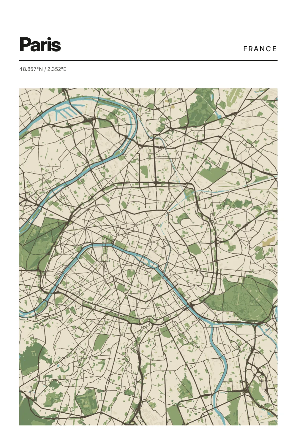
Topographic
Shown through Paris, France
Fine contour-like rhythm and quiet relief for a map that feels calm and dimensional.
Style philosophy
Mood comes from editing, not decoration.
Topographic changes how a city feels without burying it in visual noise. Emphasis shifts, contrast softens or deepens, and the place settles into a different emotional register.
The goal is not endless customization. It is choosing the right version of the city for the memory, room, or moment.
The same place, shifted
Three other readings of Paris.
Paris
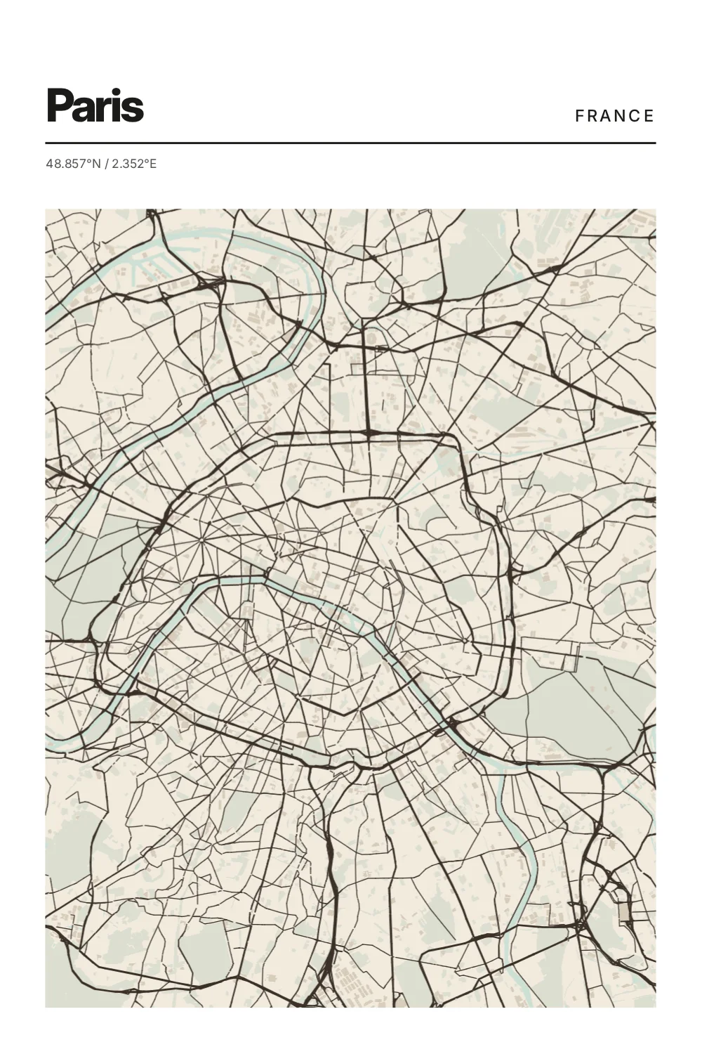
Soft Paper
Warm paper tones and low-contrast linework for a gentler, collectible feel.
Paris
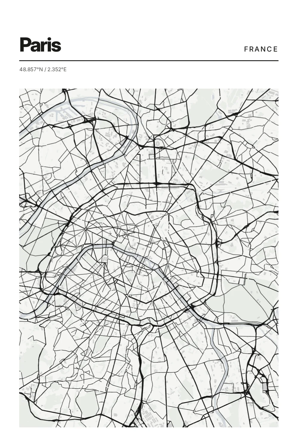
Mono
Quiet black-and-stone contrast for cities that want to feel timeless and precise.
Paris
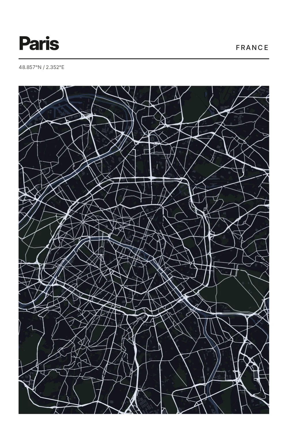
Night
Deep charcoal and softened light, like a city remembered after dark.
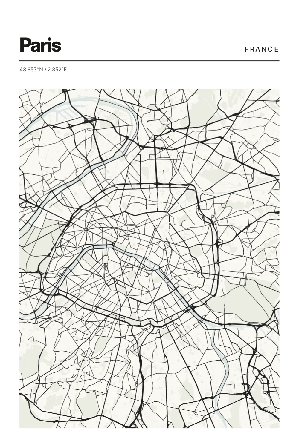
Paris
Editorial
Confident contrast and disciplined typography give the city the presence of a collected print.
Start here
Create your Topographic print.
Pick a city, keep the composition quiet, and let the style set the emotional temperature.